How to use this site
The website shows the yearly releases (emissions) of the most important pollutants
in the Netherlands. You can view these data, for example, on a map, in a graph or
in a table. Another possibility is a download into your own database. The Dutch
Pollution Release and Transfer Register (PRTR) contains a
large amount of data: for a number of years it includes hundreds of components,
more than a thousand emission sources and hundreds of individual facilities. Furthermore, emission data are
available at various spatial resolutions, e.g. province, municipality, water boards, water catchment area or grid cells (upto 1x1 km).
You can explore this information by clicking on one or more of the following links:
- Top 10 graphs and maps
-
Shows predefined maps and graphs of commonly requested data
- Top 10 Sources
-
Select a level to review the emission data and find the largest sources
- Facility report
-
View and print complete facility reports
- Make your own graph or map
-
Select and download the pollutants and emission sources of your choice to be shown
in a graph or map
- International reporting
-
Shows tables that were reported on account of international treaties
- Exports
-
Presents frequently asked exports of load to water and the applicable shape files for ArcGis.
Top 10 graphs and maps
The selection "Top 10 maps" offers you general maps of the most important emissions,
e.g. emission to air per municipality.
This map shows the total emissions in the Netherlands for one compound and the last
year.
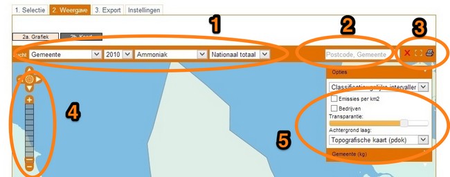
- This section shows the choices made on tabs 1a en 1b. If you want to view a different
year, a different compound or a different sector/activity than the ones supplied in the
picklists you need to return to tab [1. Select] and repick. In this example “gemeente” (municipality) is chosen as spatial resolution.
For each compartment (air, water, soil) different levels of spatial resolution are available.
- Air: province,municipality, grid cell (5x5 and 1x1 km)
- Water: river basin district, water board , catchment area (gaf-90)
- This input field is used to search the map. Initially it searches through postal area
codes. Depending on what is shown on the map, other search options become available.
, e.g. company or place names. Search by starting to type. After
two characters a first result will be shown, which will be refined futher when typing is continued. After
finding the item you want to see click to select and it is highlighted on the map, so you can easily zoom to it.
- These three buttons are used to unselect
 , zoom the current map to full screen [
 ]
and
]
and
 to print or save a PDF of the current map results. Creating the PDF file requires
up to 10-20 seconds.
to print or save a PDF of the current map results. Creating the PDF file requires
up to 10-20 seconds.
- These buttons are used to navigate the map. Zooming can be achieved by clicking
the vertical bar or using the + and - buttons. Alternatively you can press [Shift] and drag
the mouse over the map, or use the mouse scroll wheel. The arrows
up, down, left and right can be used to pan the map. By clicking the globe you return
to full map view.
- With the options section the map can be refined further. Different background layers
are available (e.g. topographic map or satellite image). Also an alternative classifications can be made, or a recalculation to
emissions per km2. Please note, that if you use the transparancy slider, the colours
in the map change but the legend is not updated accordingly. As a result, the colours might diverge.
Top
Top 10 sources
Selecting this option shows the largest emissions sources of the desired compound.
From the list you can select a category and compartment. Through the options screen, you can change the options
like the number of rows displayed, measure units, starting year and top 10 year. Graphs and tables are downloadable in CSV format.
Top
Facility report
In this section, you can review complete facility reports. All known emission
information is displayed for all compounds and compartments available. Emissions
will be shown in kg/year. The facility list can be filtered using the input fields
for easy browsing and finding a specific facility of interest. After opening
a facility report it can be printed (one facility at a time).
Top
Make your own graph or map
With "Make your own graph or map"
you can select the compartment (to air, soil or water), along with the compounds and
emission sources you want to be shown. The page shows you several tabs, [1. Select],
[2. Show], [3. Export] and [Settings]. Use tab [1a. General] to can select a compartment and the desired compounds.
Tab [1b. Sector/activity]
shows the selection screen for emission sources. By default national totals
per compound are shown. To refine, open one or more maps to display sublevels, and select the sources of your choice.
You can continue by choosing to display the data in a graph
or map, by proceeding to tab [2. Show] or selecting the appropriate button to go directly
to map or graph. After reviewing the graph you can save the data
to your own PC by using the [To Excel] button underneath the graph. This will result
in a dataset exactly as it is shown in the graph. Map data cannot be downloaded directly.
Choosing tab [3. Export] will show you the options to export
data with or without georeference. Check the appropriate separator and formatting
before exporting. Additionally you might want to check the [Settings] tab to see if
the units need to be changed.
Top
International reporting
‘International reporting’ presents several tables based on data reported by
PRTR within the framework of international treaties. These data differ from usual PRTR reports
due to treaty specific rules for reporting. Shown are greenhouse gases
as reported for Kyoto protocol, ETS (European Union Emission Trading Scheme) versus non-ETS and UN Convention on Long Range Transboundary Air Pollution.
Top
Exports
For your convenience, here you'll find some frequently asked downloads of data on pollutants to water
Spatial resolution levels are river basin district, water board or catchment area.
If you want to create your own views in ArcGis matching shapefiles are available:
- River basin districts (gaf_15)
- Catchment areas (gaf_90)
- Water board boundaries (wkl)
Top
